


FLACKERS | BRAND REVOLUTION
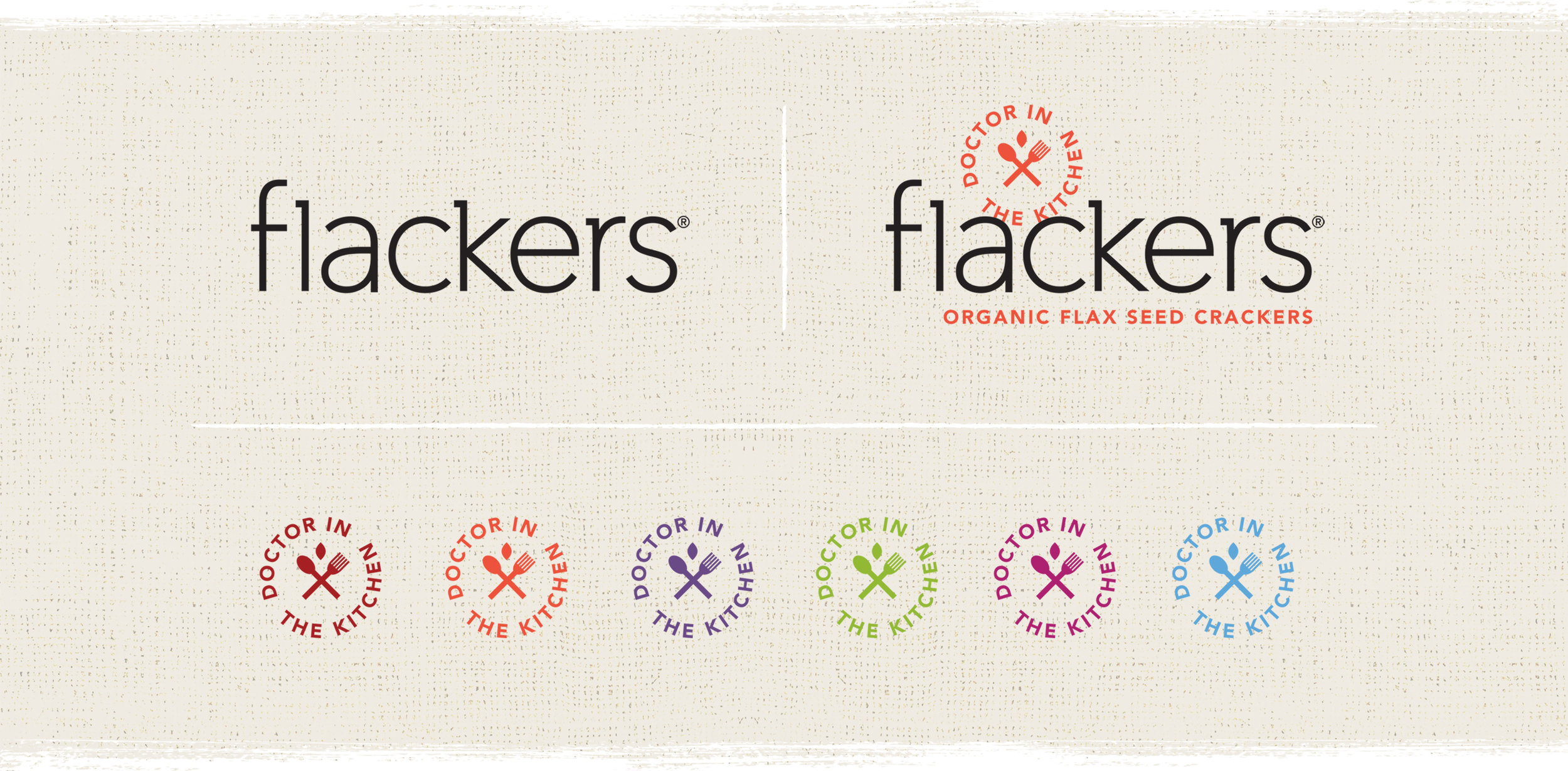
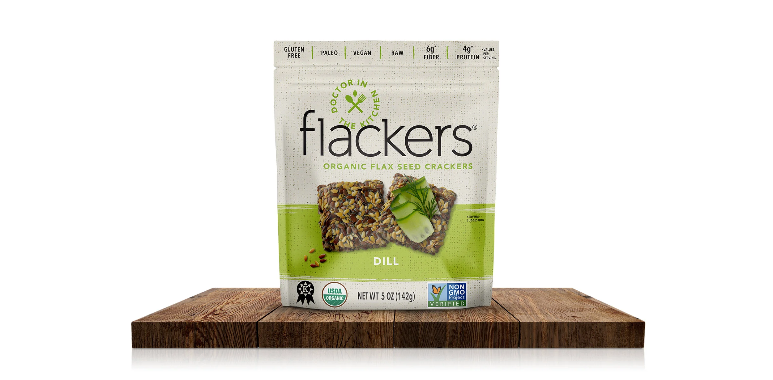
FLACKERS wanted to broaden their consumer base and create a stronger connection with health food enthusiasts. A brand revolution was in order. Addressing the hierarchy of their product benefits and shopability was essential. The nutritional bar was positioned top of package and a warm natural burlap texture was added to appeal to the all-natural shopper. Flavor cues were enhanced with new photography, plus the addition of a serving suggestion and a color bar to differentiate the flavor offerings. Lastly, the packaging structure was updated from box to bag for on-the-go convenience, as well as cost savings. With a 300% increase in sales, eating healthy is also great for business!
BRAND ARCHITECTURE + BRAND DESIGN + PACKAGE DESIGN + STRUCTURE UPDATE + BRAND ASSET GUIDE + PRODUCT PHOTOGRAPHY + PRINT MANAGEMENT